From structure to screen
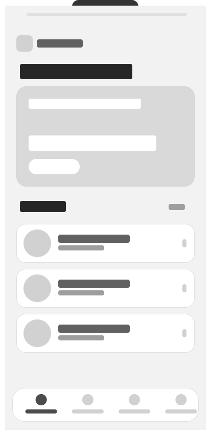
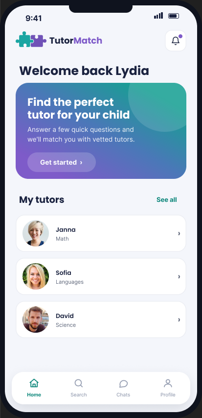
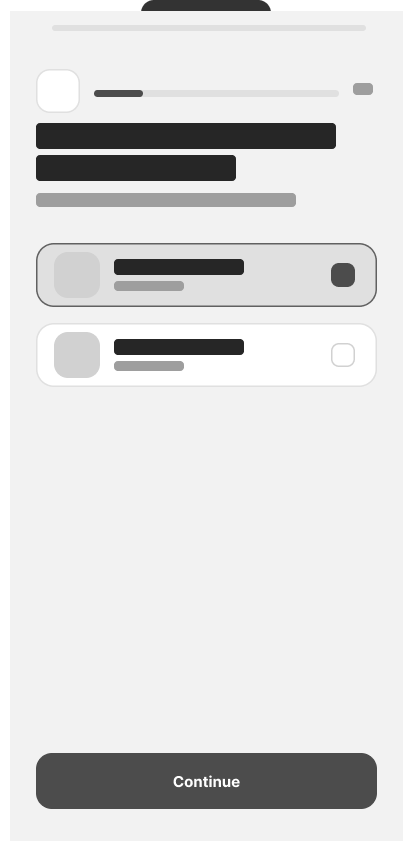
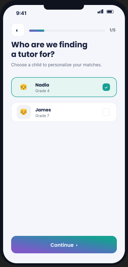
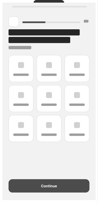
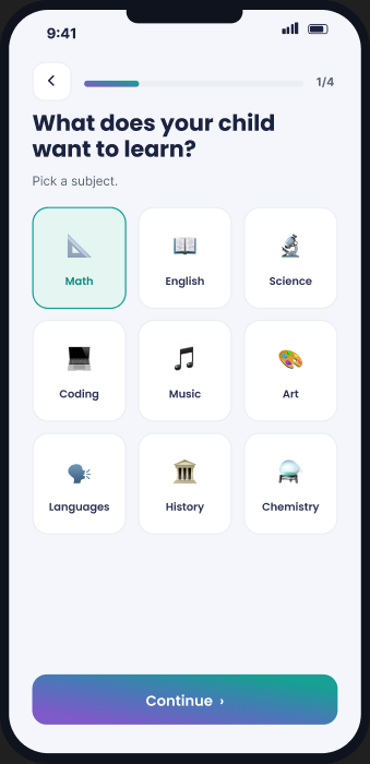
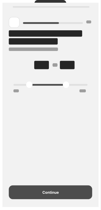
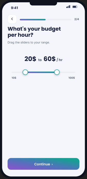
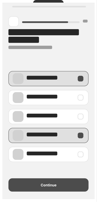
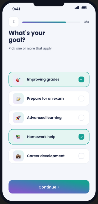
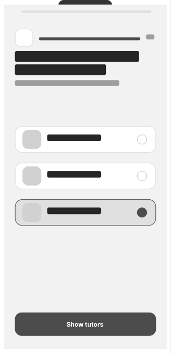
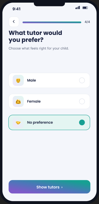
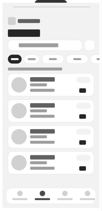
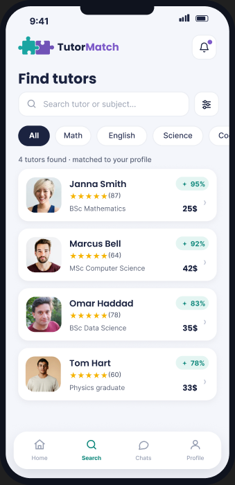
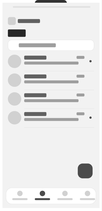
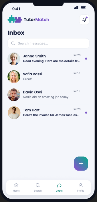
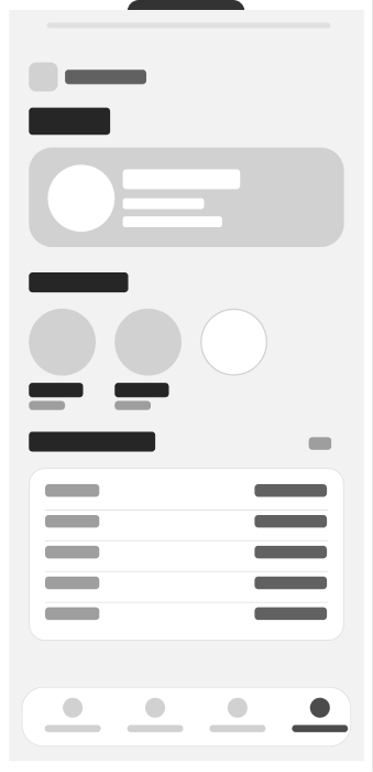
Wireframe first, styling second.
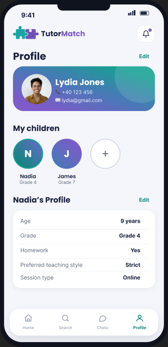
Every one of the eleven screens went through the same discipline: prove the layout holds up in grayscale before a single brand colour gets applied.


Case study
A mobile app, and later a responsive website, that let a parent describe what their child needs in under a minute and get back a ranked shortlist that says why each tutor matched. I did the research, the design and the front-end build.
Parents look for tutors through Facebook groups and word of mouth, with no easy way to compare qualifications, price or fit for their specific child. It is slow, and it is hard to trust a stranger from a group chat.
Let a parent describe what their child needs in under a minute, and surface a ranked, transparent shortlist of matched tutors, then keep messaging and booking in the same app so nothing falls through the cracks.
How I got there
Mapped the problem and a primary persona, Lydia, from real parent frustrations.
Sketched several directions for the onboarding and matching flow before settling on a guided quiz structure.
Diagrammed the chosen flow step by step to see exactly where parents could get stuck.
Low-fi screens for every step, kept deliberately ugly so structure got judged on its own.
Visual design, a full component system, then a working interactive build.
Looking outward
Before designing a single screen, I audited three tutor-matching products parents already use, one direct competitor and two indirect ones, to see what was worth keeping and what was worth deliberately doing differently.
Huge subject coverage, plus tutor reviews.
No compatibility matching at all, so parents read through many tutor descriptions by hand just to judge fit.
A thorough intake questionnaire that actually identifies what a user needs.
Its progress is never shown, so the questionnaire can feel never-ending.
Preference-based matching and a clear “how it works” page with real stats.
Forces booking before a parent has even messaged the tutor.
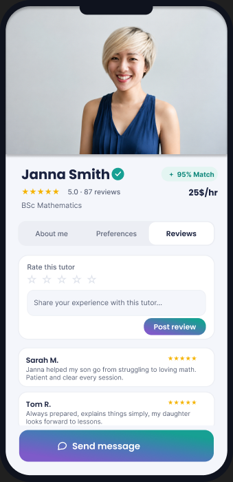
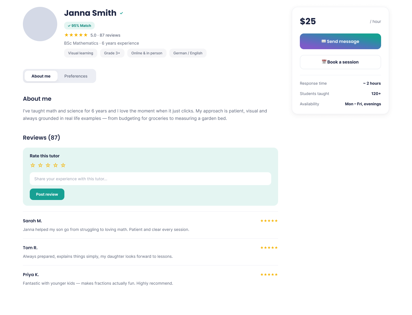
None of the three gave a parent a transparent, up front sense of why a tutor was the right fit, none showed onboarding progress clearly, and one asked for a booking before a single message was exchanged. Those gaps are exactly what TutorMatch answers directly, a staged quiz that shows its own progress, a “95% Match” and “Why you were matched” on every tutor profile, and a message-first path before anyone books anything.
Grounding the decisions
Every screen had to answer a question a real parent would ask. I built a persona, Lydia, from the goals and frustrations parents mention most often when searching for a tutor, and used her to pressure-test every flow.
Marketing manager, mother of two
“I don’t have hours to vet tutors myself, I just want to know someone is qualified, safe, and actually a good fit for my kid.”
Mapping before designing
Mapping the onboarding quiz step by step made a gap obvious: nothing in the flow asked which child the parent was even looking for help with, even though most families in my research had more than one. That single flow diagram is what led to the extra step you can see in the comparison below.
Edge case: if fewer than three tutors match, the results screen widens the budget range automatically and flags it to the parent, rather than showing an empty state.
Testing surfaced another gap
My first pass matched each child to tutors from their stored profile alone, subject and general goals, set once and reused for every search. Usability testing said otherwise. Parents kept pointing out that what matters most does not stay fixed per child, it changes per search: the same child might need a cheaper tutor this time and a tutor focused on one specific goal next time, exam prep instead of general homework help, and a profile set up once cannot capture that.
Budget, goal and tutor preference lived on the child’s saved profile, set once and reused for every search.
Budget, goal and preference moved into a short quiz that runs fresh every time a parent starts a new search.
That is why budget, goal and preference in the flow above are their own quiz steps each time, rather than settings buried in a profile.
Deciding what not to build
Early on I wanted every child to have a progress dashboard, something that showed how they were doing across their lessons. It sounded like the kind of feature a parent would want, so I kept it in the plan longer than I should have.
Sessions attended, hours logged, subjects covered, shown as charts on the child’s profile.
I could not find a single statistic that was actually informative. Sessions attended and hours logged say a child showed up, not that they understood anything. Nothing I was able to measure answered the question a parent is really asking, which is whether their child is getting better.
The honest answer is that the tutor already knows, and a message from them says more than any chart I could have drawn. A dashboard that looks informative but is not is worse than no dashboard, because parents would trust it and stop asking.
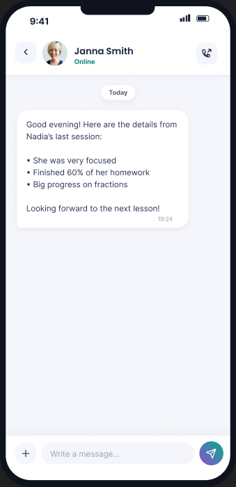
So the space went to messaging and tutor-written session reports instead, where the real signal already was.
Before the guided quiz
The guided quiz was not the first idea. I sketched several directions for the onboarding and matching flow first, and let each one fail on its own terms before settling on the structure used today.
One long profile-and-preferences form up front, before showing any tutors.
Felt overwhelming and gave parents no sense of progress.
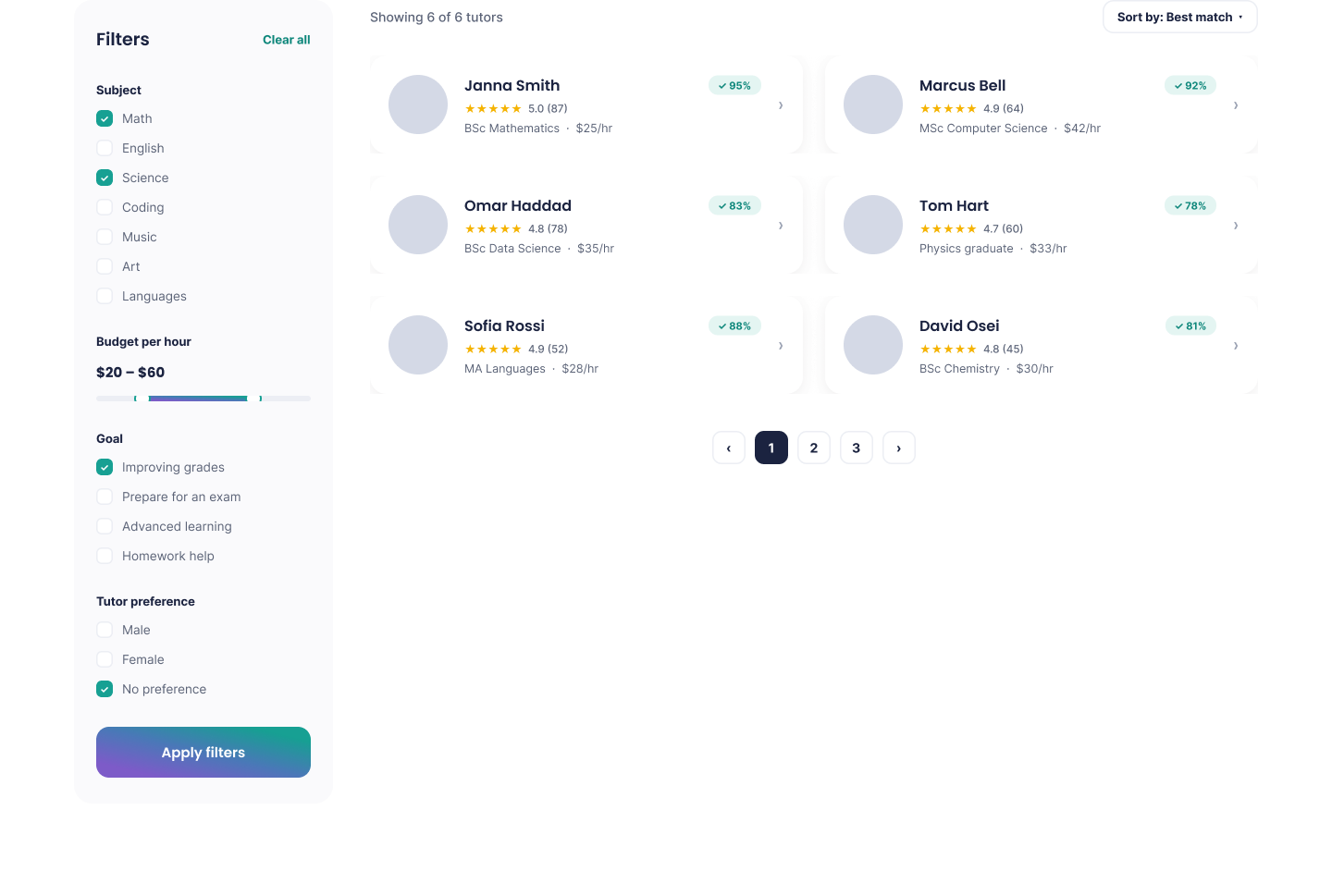
Show every tutor immediately, with filters tucked into a side panel.
No way to express what mattered most for a specific child, just more scrolling.
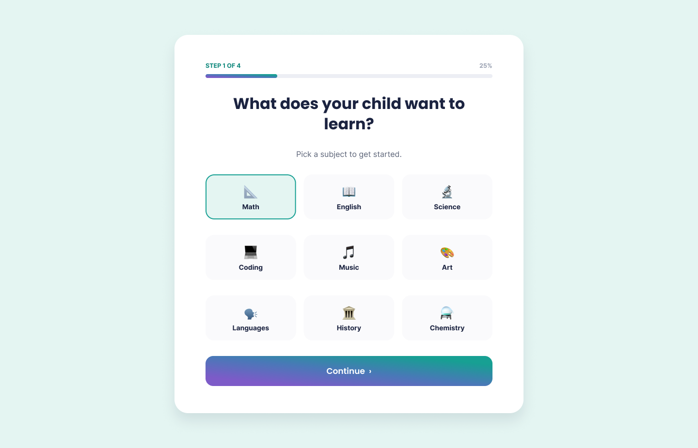
A short, staged quiz that builds a visible match score as you answer.
Front-loads what a parent actually cares about, instead of asking them to sift through everyone.
From structure to screen
Every one of the eleven screens went through the same discipline: prove the layout holds up in grayscale before a single brand colour gets applied.
Beyond mobile
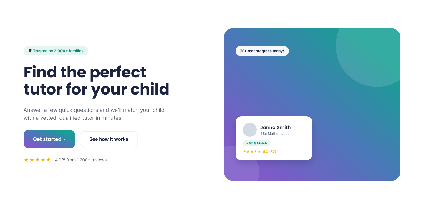
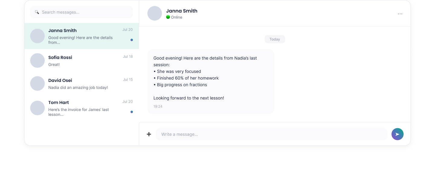
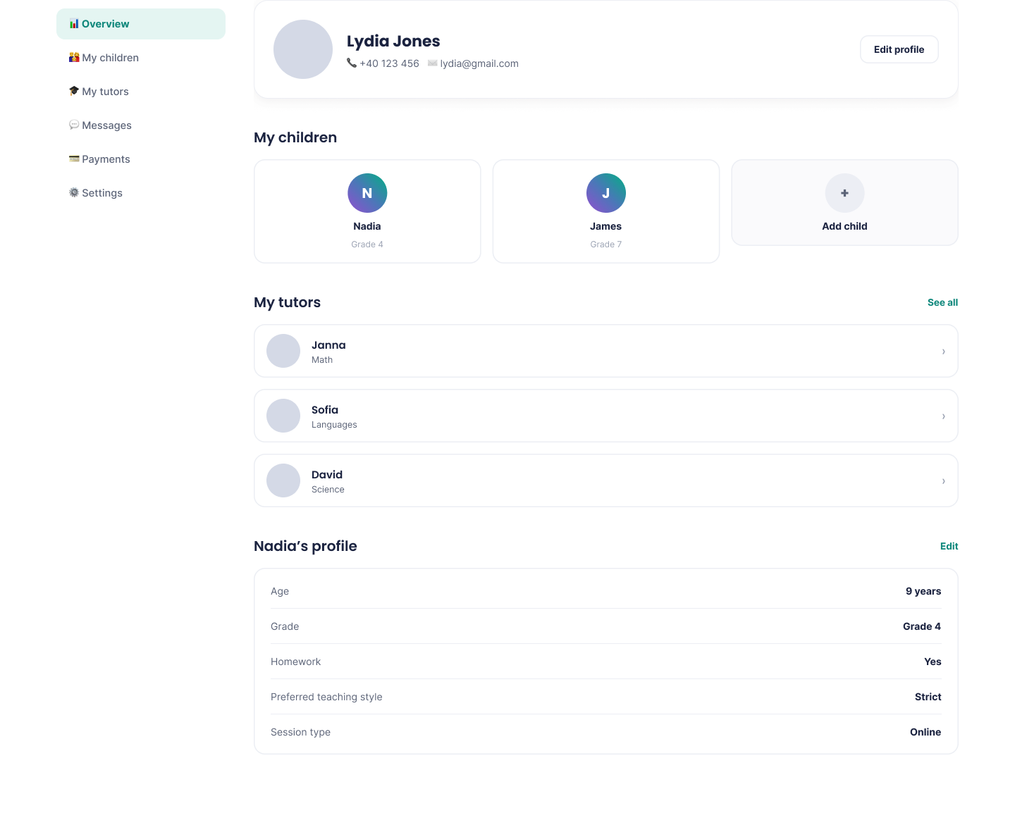
Some parents research a tutor on their laptop during a work break rather than on their phone. I extended the same product, tokens and component logic into a responsive marketing and account website, so the experience feels continuous across devices instead of like two different products.






Reflection
This was my first solo, end-to-end project, and it changed how I start one. Writing the flow out before opening Figma found a missing step that staring at screens never would have. Building the prototype myself kept me honest about which interactions were actually as simple as they looked on paper. And scrapping the dashboard taught me the part I did not expect: deciding what not to build is design work too, not a failure to finish.