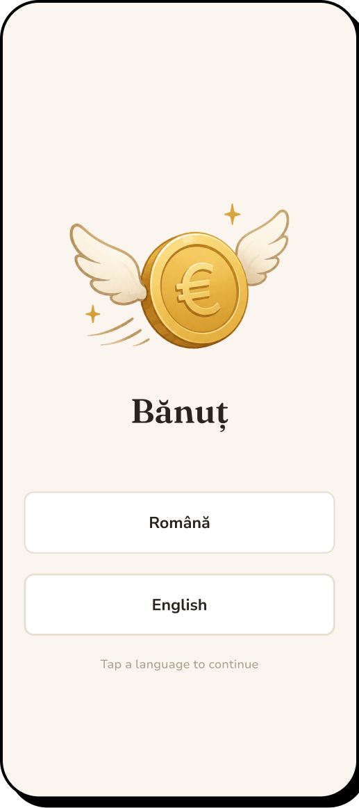
Stage 01
Context
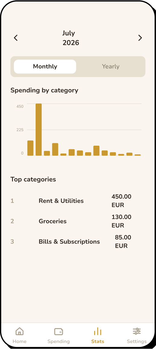
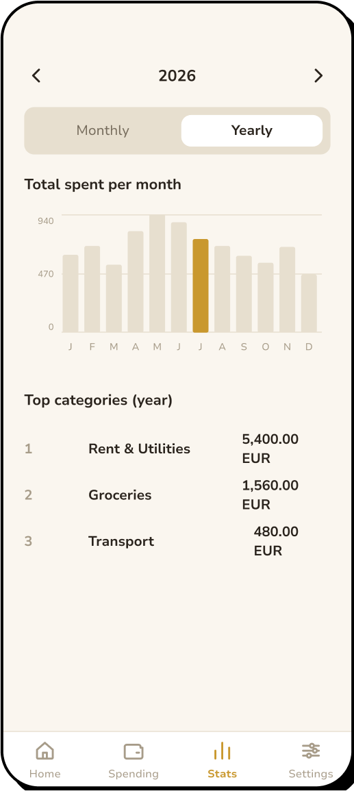
A mobile application designed to make expense tracking so quick and easy that you can do
it on the go. With this app, households no longer need to struggle budgeting with messy
spreadsheets, as expense tracking is fast and intuitive, and it includes monthly and
yearly spending statistics. Design & development done by me.
The problem
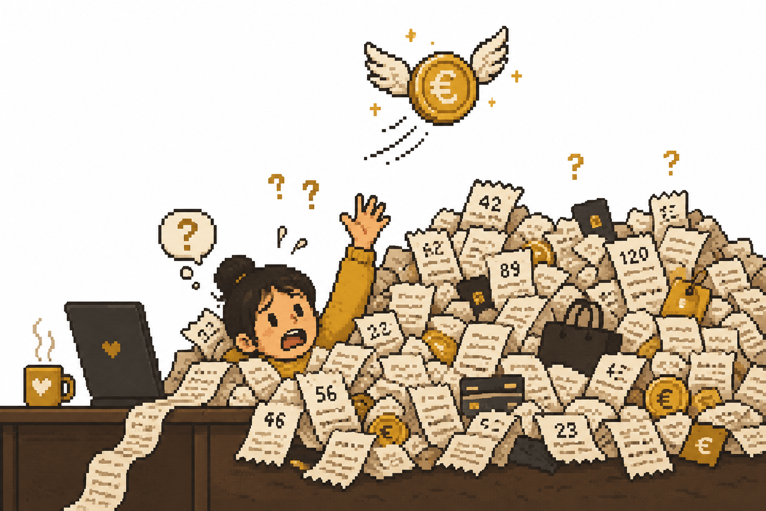
Spending happens in a dozen small moments, one card here, cash there, a subscription
nobody remembers starting. At the end of the month there is a number in the banking
app and no explanation for it.
The goal
Logging has to be fast enough that it isn’t a hassle. Three taps from opening
the app to a saved expense, so people can do it on the go and avoid forgetting to
track expenses.
Stage 02
Research
Research started with an audit of direct and indirect competitors, in order to identify
the strength and weaknesses of existing products before deciding what to implement in
the app.
-
Wallet (budget bakers)
Direct competitor
Strength
Bank sync, strong reports, budgets, automatic categorisation.
Gap
Designed as a full personal-finance system, but certain features are locked behind a paywall.
-
Spendee
Direct competitor
Strength
Polished visual analytics, bank connections, budgets.
Gap
Shared finance is organised into wallets rather than around a household-first experience.
-
Strength
Strong categories, reports and goal planning.
Gap
Focuses more on planning where money should go before/while spending it.
The idea for this application came from my own need for a simple and intuitive expense
tracking system to replace the good old spreadsheet system. After exploring existing
solutions, I found that most offered far more functionality than I needed, making a
simple task feel unnecessarily complex.
Stage 03
The user
Two user personas, taking into consideration the two main types of users.
Amy
“The initiator”
- Age
- 26
- Occupation
- Junior Associate
- Income
- 1800$
- Tech comfort
- Medium
“I want us to actually know where our money goes, not guess at the end of the month and wonder where it all went.”
Goals
- See the full household spending picture at any moment
- Make financial decisions together as a team, not one person carrying the mental load
- Spot patterns (“we spend way too much on food delivery”) and adjust mindfully
Frustrations
- Her partner forgets to log on a spreadsheet or does it at night when memory is fuzzy, which corrupts the data
- Spreadsheets work on desktop but are painful mid-purchase on mobile
- Existing apps either split bills (not what she wants) or are bloated with features she doesn’t need
Jake
“The participant”
- Age
- 28
- Occupation
- Software Developer
- Income
- 2500$
- Tech comfort
- High
“If logging takes more than a few seconds I’ll procrastinate and I’m going to forget about it. I’m not going to do it later, I know myself.”
Goals
- Contribute to the tracking without it feeling like admin work
- Not be the reason the household data is incomplete
- Know roughly where money is going without actively managing it
Frustrations
- Remembering to log after the fact is nearly impossible; he pays and moves on
- Feels guilty when Amy’s dashboard is incomplete because of him
- Finance apps feel like work clouded with too many features and views and he already stares at a screen all day
Stage 04
Flow
The main user flow focuses on logging an expense, iterated and refined until the process
is as simple and quick as possible.
-
Open app
Lands on Home
- →
-
Home
Taps “Logs expense”
- →
-
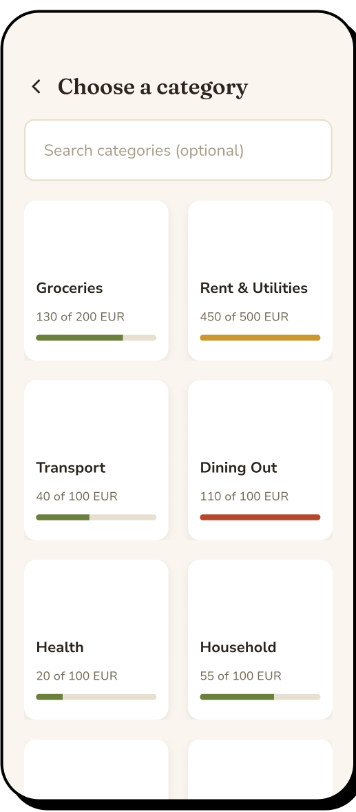
Choose category
14 categories
- →
-
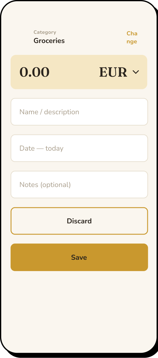
Log form
Fill in details
↓
-
Save expense
Log details saved
- →
-
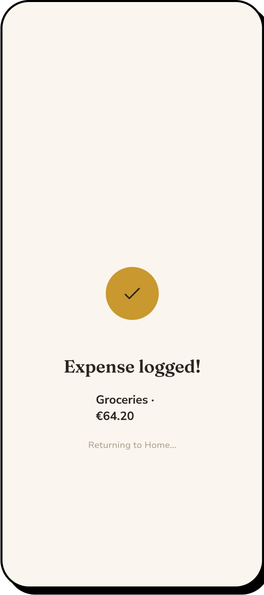
Success screen
Brief animation
- →
-
Home
Log appears in recents
Stage 05
Ideation
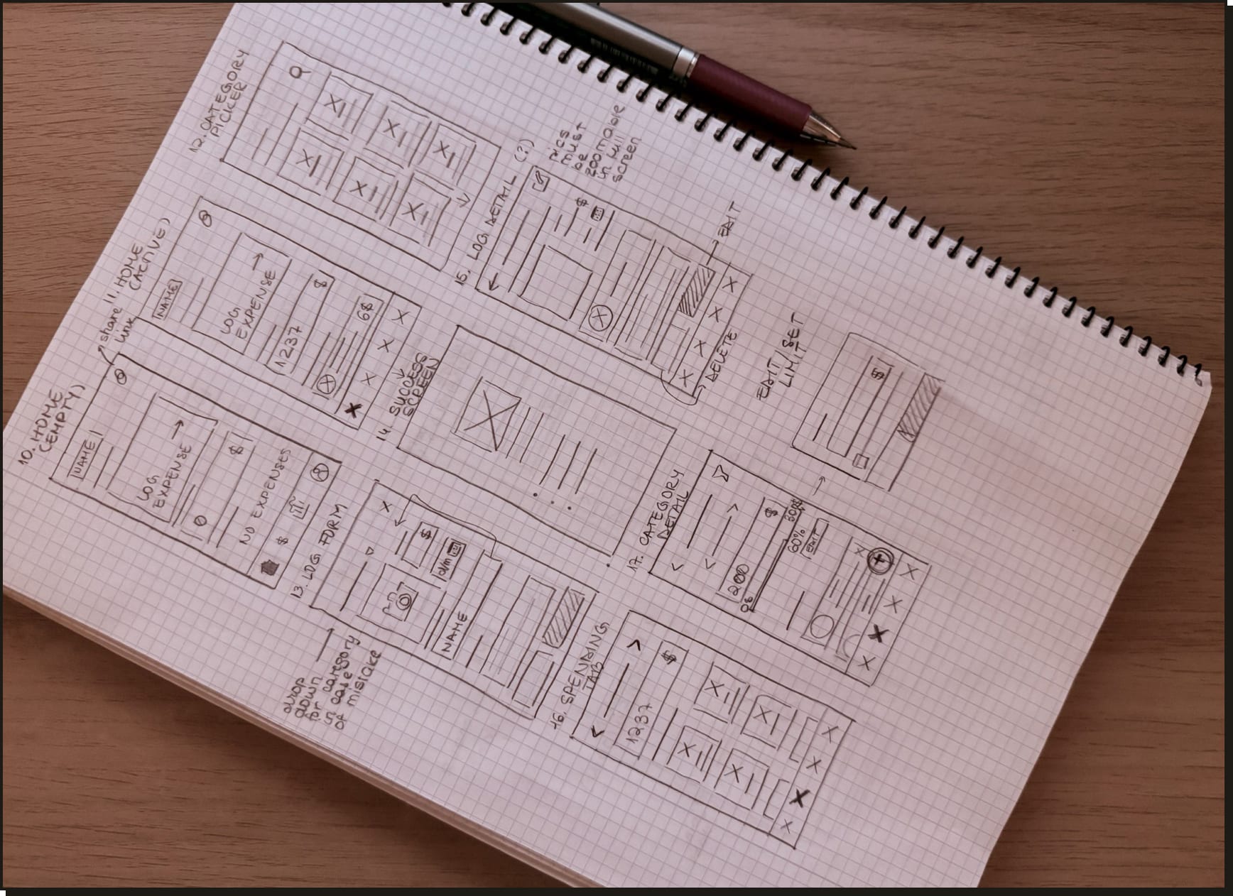
The initial design of the application was way simpler than its current state. The point
was simply to make logging as quick as possible, however after user interviews and
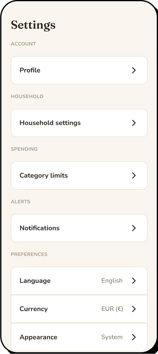
testing, I’ve leaned more into the idea of including budget limits, to help keep
users aware of their financial standing. This change included spending limits per
household and per category, as well as detailed spending insights (monthly spending per
category, yearly spending per category and per month average, detailed logs in each
category).
Some initial sketches
Stage 06
UI design
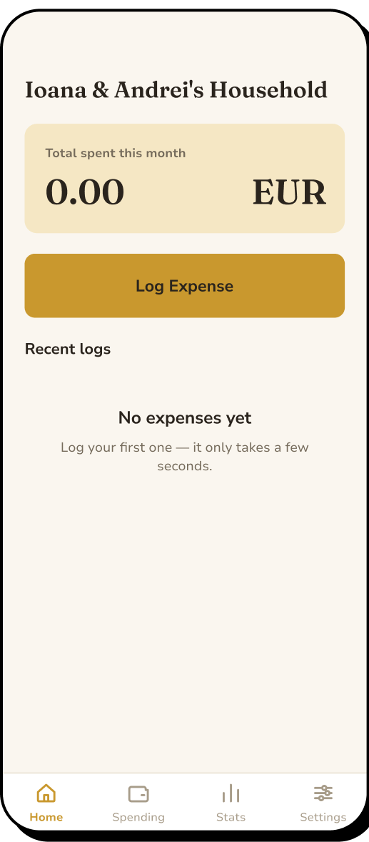
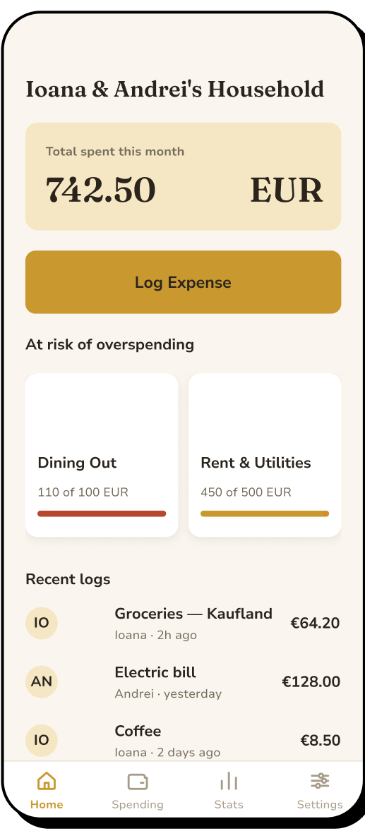
From simple wireframes to polished UI designs.
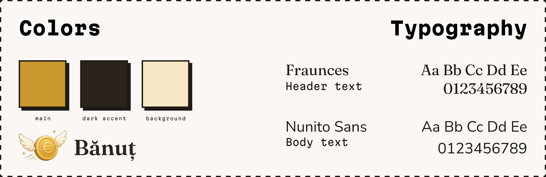
Hi-fi mock-ups
Stage 07
Prototype
Interactive HTML prototype created for testing. Try it out!
-
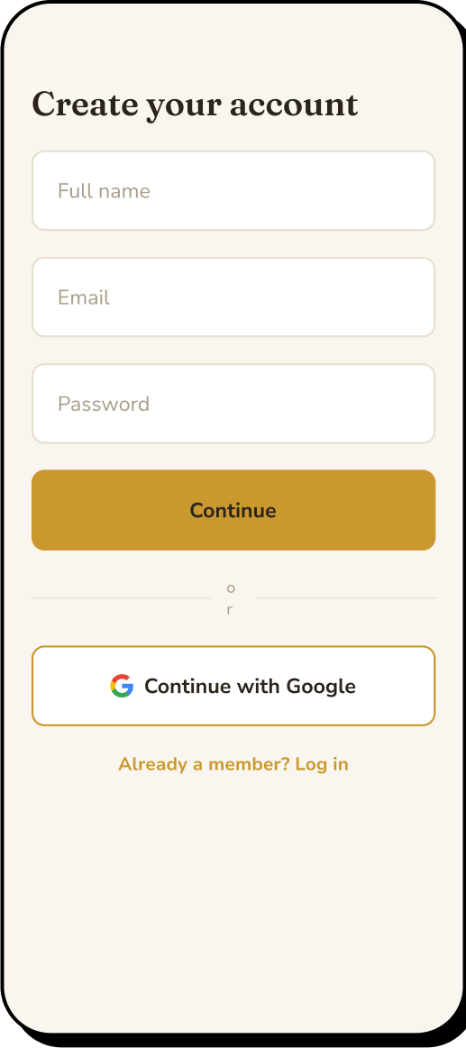
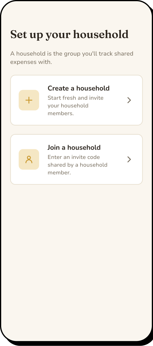
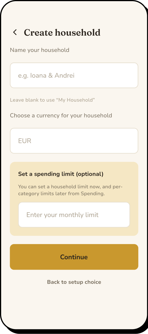
Onboarding
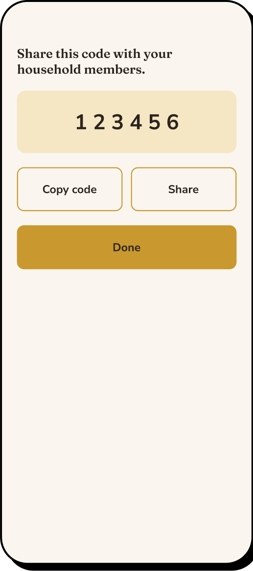
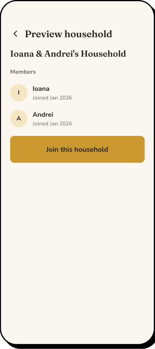
Sign-up through to creating or joining household
-
Log expense
Log an expense in just a few taps
-
Spending insights
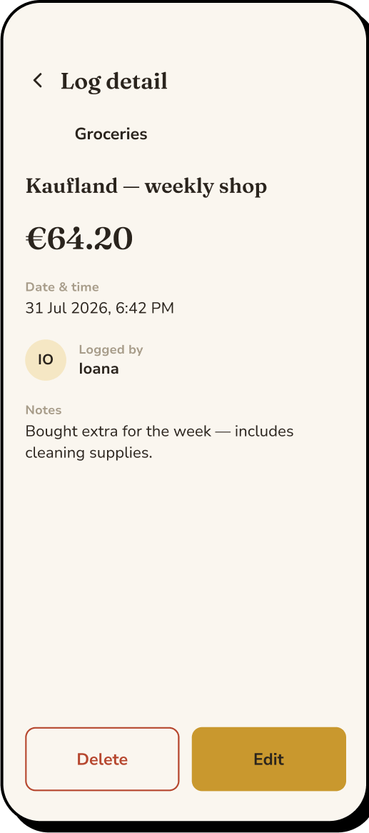
View the details of a log or monthly spending.
Open the prototype in a new tab →
Stage 08
Testing
I conducted usability testing with a group of individuals aged from 22–54, and the
feedback greatly increased the user experience the app offered. While the younger users
were more focused on improving UI features, placing buttons for commodity or where
certain actions are expected, the older users were providing very constructive feedback
on what features the app offers, and provided many great ideas to consider.
Some ideas I implemented
-
Improved navigation
Wherever a category name appears, users can navigate to the detailed page of that category by tapping it.
-
Diverse currency
Added the possibility of logging expenses in multiple currencies, converted into the default household currency at live exchange rates for the total spending insights.
-
Informative dashboard
Added a new category to the home dashboard which displays categories “At risk of overspending” (for categories with set spending limits).
Stage 09
Reflection
Bănuț started from a problem I couldn’t find a good solution for in existing
finance apps: understanding shared spending without needing to split every expense.
Designing around this specific use case made me realise how important it is to define
what a product isn’t just as clearly as what it is.
The project also gave me the opportunity to take an idea through the full UX process,
from competitor and user research to prototyping, testing and developing. The research
helped me make design decisions based on actual user priorities rather than my own
assumptions about how people manage shared money.
As I continue developing Bănuț, I plan to test it with users over a longer period of
time. Since much of its value comes from identifying spending patterns, I think real
usage over several weeks or months would reveal things that a prototype test cannot.
← Back to site