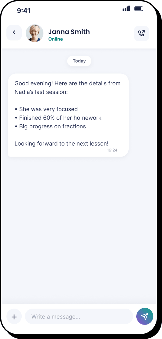
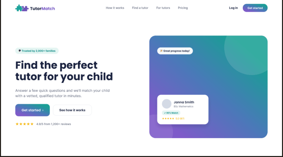
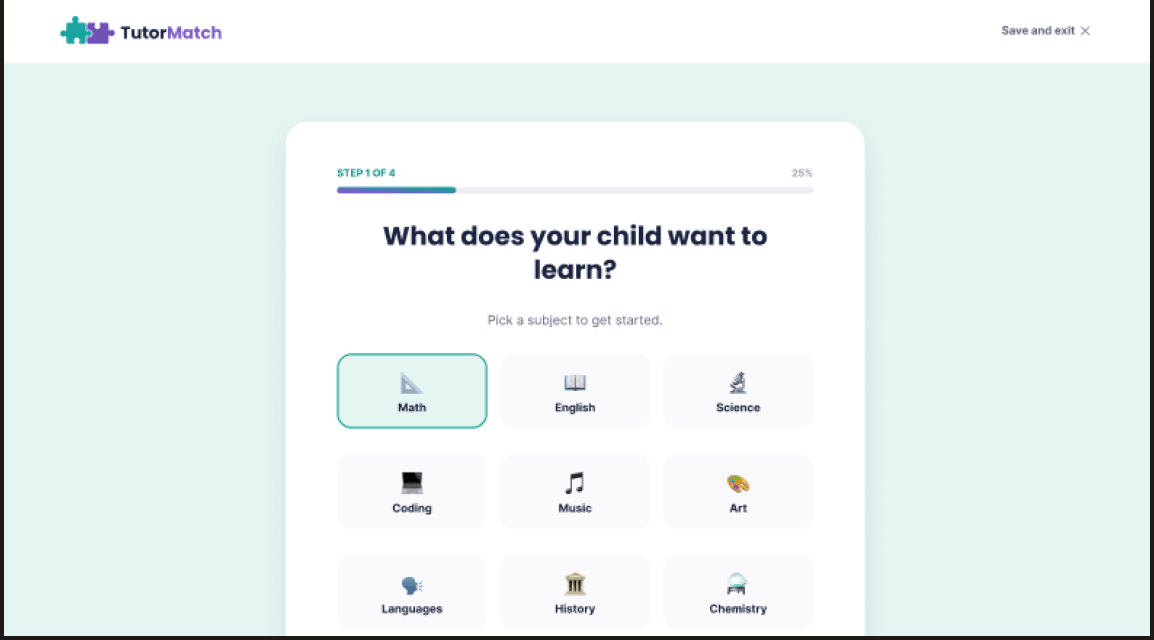
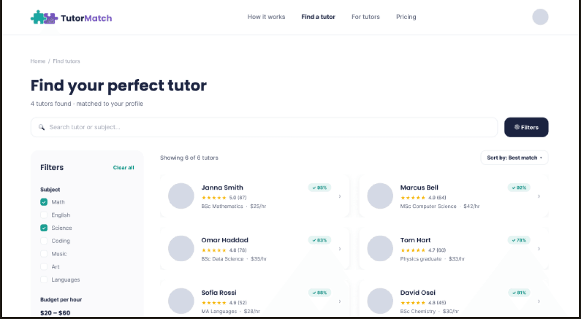
Product & brand design for a tutor-finding app and responsive website with personalised recommendations.
Stage 01
Context
A mobile app, and later a responsive website, that lets a parent describe what their
child needs in under a minute and get back a ranked shortlist that says why each tutor
matched. I did the research, the design and the front-end build.
The problem
Parents look for tutors through Facebook groups and word of mouth, with no easy way
to compare qualifications, price or fit for their specific child. It is slow, and it
is hard to trust a stranger from a group chat.
The goal
Let a parent describe what their child needs in under a minute, and surface a
ranked, transparent shortlist of matched tutors, then keep messaging and booking in
the same app so nothing falls through the cracks.
Stage 02
Research
Before designing a single screen I also audited three tutor-matching products parents
already use, one direct competitor and two indirect, to see what was worth keeping and
what was worth deliberately doing differently.
Superprof
Direct competitor
Strength
Huge subject coverage, plus tutor reviews.
Gap
No compatibility matching at all, so parents read through many tutor descriptions by hand just to judge fit.
Preply
Indirect competitor
Strength
A thorough intake questionnaire that actually identifies what a user needs.
Gap
Its progress is never shown, so the questionnaire can feel never-ending.
Tutorful
Indirect competitor
Strength
Preference-based matching and a clear "how it works" page with real stats.
Gap
Forces booking before a parent has even messaged the tutor.
I continued by conducting short user surveys with a group of parents, asking them what
issues they have encountered when previously looking for a tutor for their children and
what would they like to see in a tutor-finding application.
Stage 03
The user
I built a persona, Lydia, from the goals and frustrations parents mention most often
when searching for a tutor.
Lydia Jones
Marketing manager, mother of two
Age
38
Family
2 children (9 & 12)
Tech comfort
Medium
“I don’t have hours to vet tutors myself, I just want to know someone is
qualified, safe, and actually a good fit for my kid.”
Goals
Find a qualified tutor quickly, without endless research
Feel confident the tutor is vetted and safe
Keep track of progress across both kids in one app
Frustrations
Facebook groups feel unreliable and unstructured
No easy way to compare price, subject fit and reviews
Hard to message and schedule outside one app
What matters most
Trust & safety95%
Convenience85%
Price sensitivity60%
Flexibility70%
Stage 04
Flow
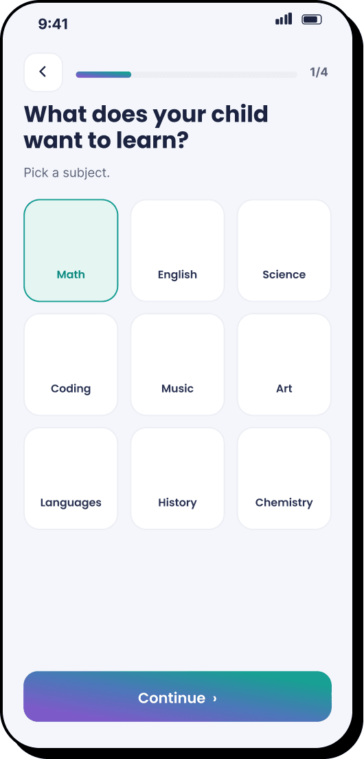
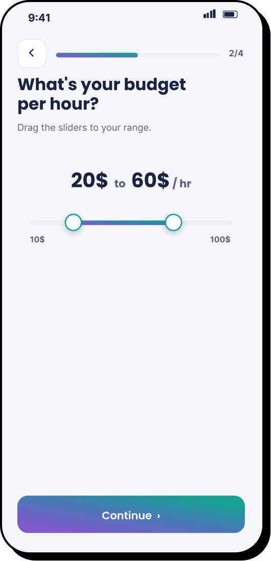
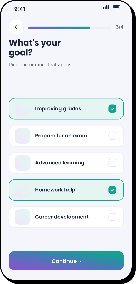
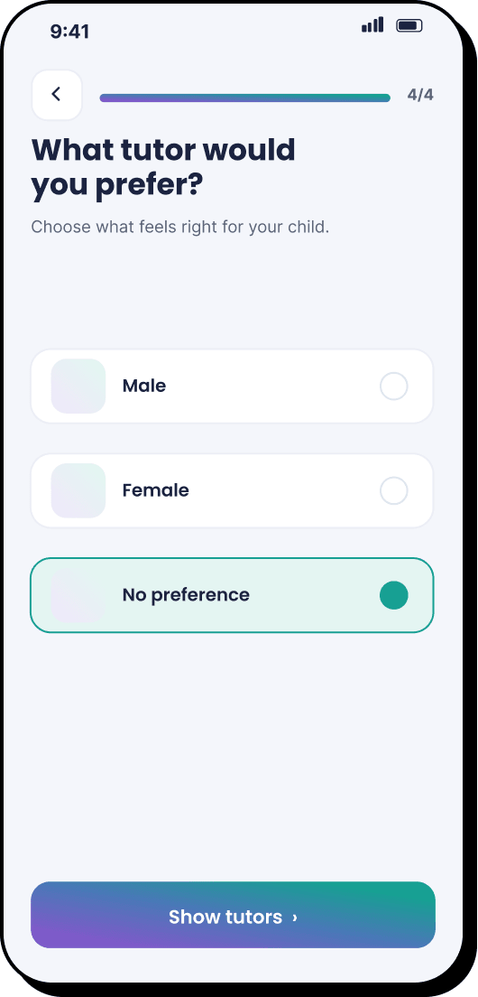
Designing the user flows helped me decide the best course of action for the matching
algorithm. Initially I had planned to have all the child data in the profile and match
them with tutors based on their general preferences, but user surveys revealed that some
parents may have specific requirements for each tutor their child has for different
subjects, so tutor-specific preferences have been moved to a guided quiz.
Open app
Lands on Home
→
Home
Taps “Get started”
→
Choose child
Picks which child
→
Subject
Picks a subject
↓
Budget
Sets hourly range
→
Goal
Selects one or more
→
Preference
Tutor preference
→
Results
Ranked tutor list
Stage 05
Ideation
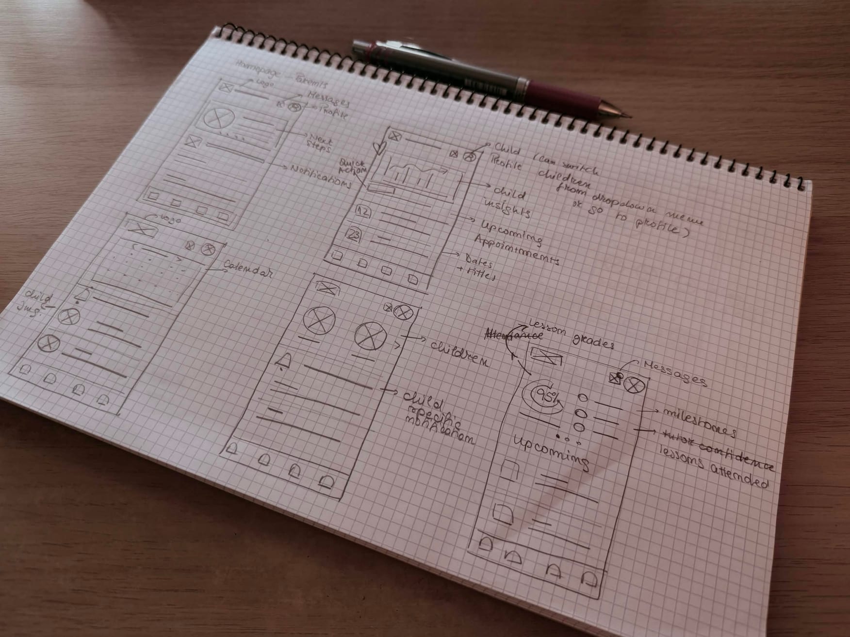
I’ve scrapped a few ideas before landing on the guided quiz matching and direct
tutor messaging. Some worth mentioning: in-app booking and calendar tracking (removed to
make app simpler for parents who aren’t tech savvy) and child progress tracking
(removed because statistics weren’t informative).
Some initial sketches
Stage 06
UI design
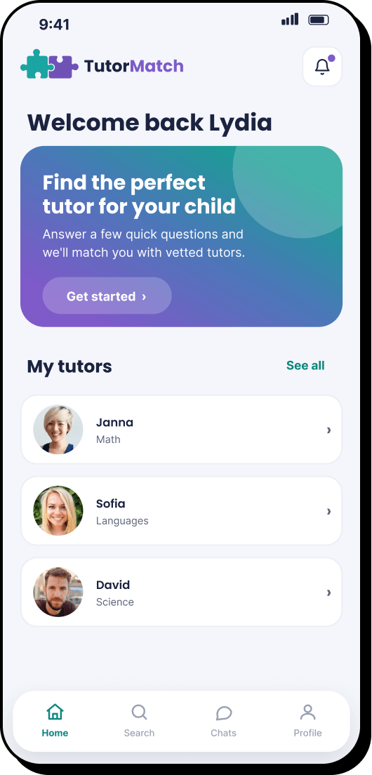
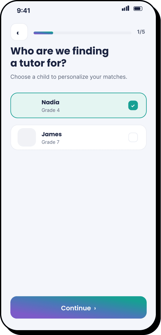
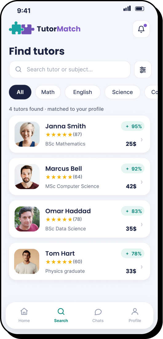
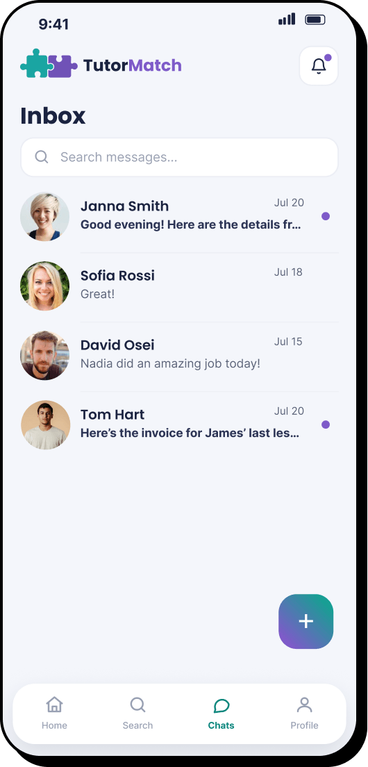
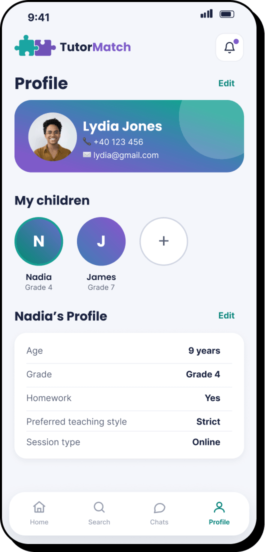
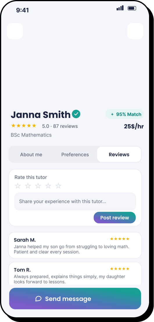
From simple wireframes to polished UI designs.
Hi-fi mock-ups
Stage 07
Prototype
Interactive HTML prototype created for testing. Try it out!
My first pass matched each child to tutors from their stored profile alone —
subject and general goals, set once and reused for every search. Parents kept pointing
out that what matters most does not stay fixed for each tutor the child needs, it
changes per search: the same child might need a cheaper tutor this time and a tutor
focused on exam prep the next.
Before
Budget, goal and tutor preference lived on the child’s saved profile, set once
and reused for every search.
→
After
Budget, goal and preference moved into a short quiz that runs fresh every time a
parent starts a new search.
Stage 09
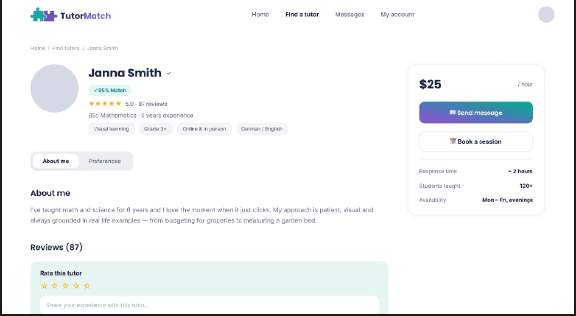
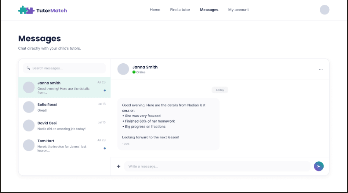
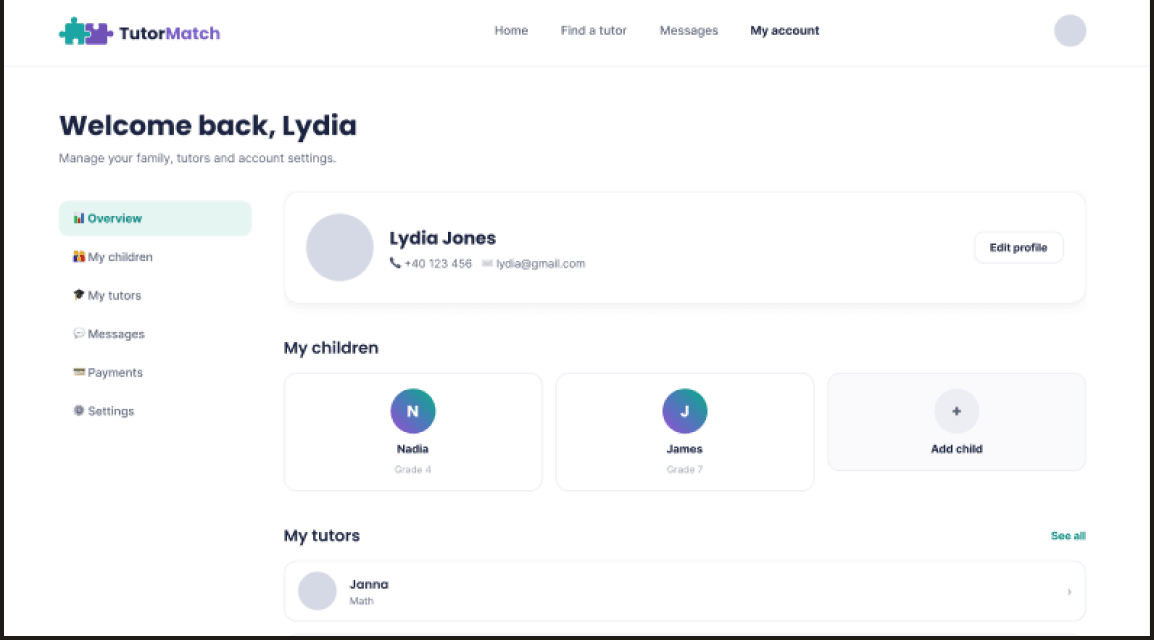
Responsive web app
Some parents research a tutor on their laptop during a work break rather than on their
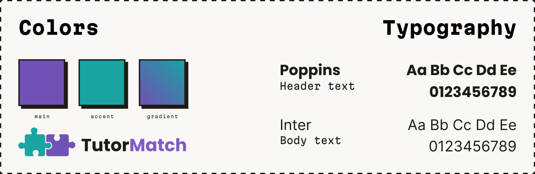
phone. I extended the same product to a responsive web application, sticking to the same
design system.
Stage 10
Reflection
This was my first product design project, completed during the Google UX Design
Professional Certificate. It helped me understand the importance of taking the proper
steps in the user research and reiterating the design process in order to reach the best
outcome, but also of knowing when to challenge my own decisions.
The most important takeaway is that more isn’t always better; I decided to scrap
the uninformative dashboard and it resulted in a cleaner user experience.